At any point in your event's lifespan, you want to be on top of how it is performing and what sort of activities your attendees are doing within it. With event analytics, you are able to get that insight right away, using the most up-to-date information available.
Note: This feature is reserved for Event Package plan holders. If interested, please contact our Event Experts at sales@bigmarker.com or your customer success manager.
How to View the Analytics Dashboard
After logging in, visit the event dashboard of your event, then click on Analytics from the left-hand menu.

In the analytics, you'll see the following sections. Click on the links below to jump to the information for that section.
Registration
In the Registration tab, you can see an overview of how many people registered and where they came from. You will first see a breakdown of some of the most important numbers like total registered and total revenue, as well as a breakdown of registrants over time.
Tip: For this page and all others in the analytics section, you can decide which timeframe to look at by clicking the data range button in the top right. By default, it will display the start time to the end time of your event

Below the graph you'll be able to see registrations broken down by different categories. Each of these views can help give insight to how your registration is performing across regions and campaigns:
Daily Registrations by Source gives you information as to how users reached your pages to register over time. You'll see them broken out by these groups:
- Direct - These registrants are directly from the BigMarker platform
- Email - These registrants were from email invitation
- Social Media - These registrants were from Facebook, Twitter, LinkedIn, Instagram, TikTok, etc.
- Import - These registrants are added by a Presenter through CVS file and/or manual upload
- Other - These registrants were integrated into the platform typically by registering through referrals.
Additionally, you'll see other breakdown of how many registrations you received by country, ticket selection, referral domain and UTM codes.
Audience
The Audience tab will show all the attendees analytics for your event, such as the current attendees in any associated webinars, unique visitors, peak attendees, average duration they were at your event and more.
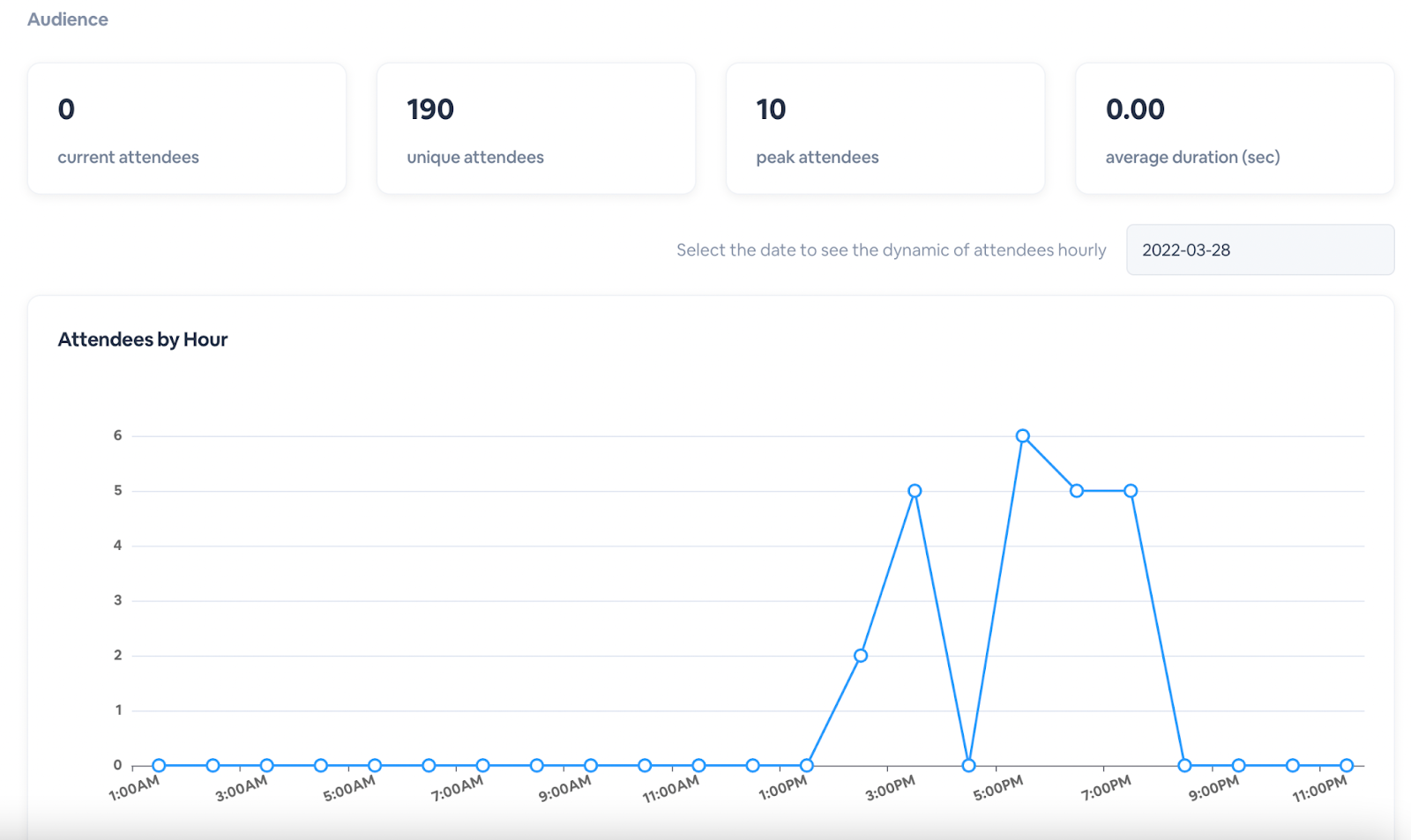
You'll also get a breakdown of Attendees by Day which displays the number of attendees present on each day of your event. Select the time frame of choice and you will see the number of attendees that attended your event per day. Hover over the bar to view how many attendees were in your events on specific days.

Just like in the registration section, you'll get some further breakdowns of attendees by country and device.
Attendee Flow
The Attendee Flow tab lists all of the modules and sessions that are a part of your event. These will show as modules where you can observe in real-time how many attendees are currently in specific live webinars.
For each module, you will see the overall number of current attendees, total unique session attendees, current unique visitors, total unique visitors, total visits, and the number of sessions. If there are other webinars or sessions associated with that module, they will appear below as a dropdown menu where you can view the specific analytics for that webinar/session.

Content
The Content tab shows the most popular content, engagement features, sessions, chat rooms and more. This is where you will be able to identify your event's most popular sessions, booths and networking opportunities.
Under Most Popular Sessions is a list of the most popular sessions. This includes all the webinars (live and evergreen) associated with the main series. In each row is the name of the session, what track it's located within, how many attendees attended and the other engagement features, such as Q&A, chats, offers, and handouts.

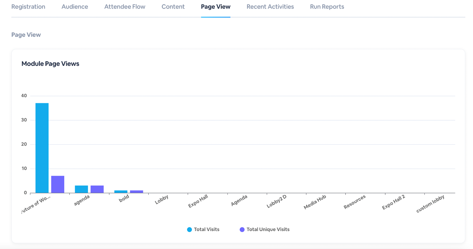
Page View
The Page View tab displays the individual page views and unique visits combined for various modules within your Virtual Event. This is similar to the Audience Flow Tab, but also includes total page views for pages within the networking center and check-in, and the On-Demand Library.
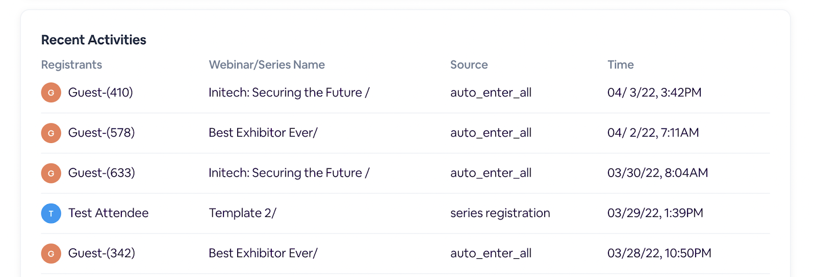
Recent Activities
The Recent Activities tab shows the most recent activity associated with your virtual event, including recent event and session registrations.
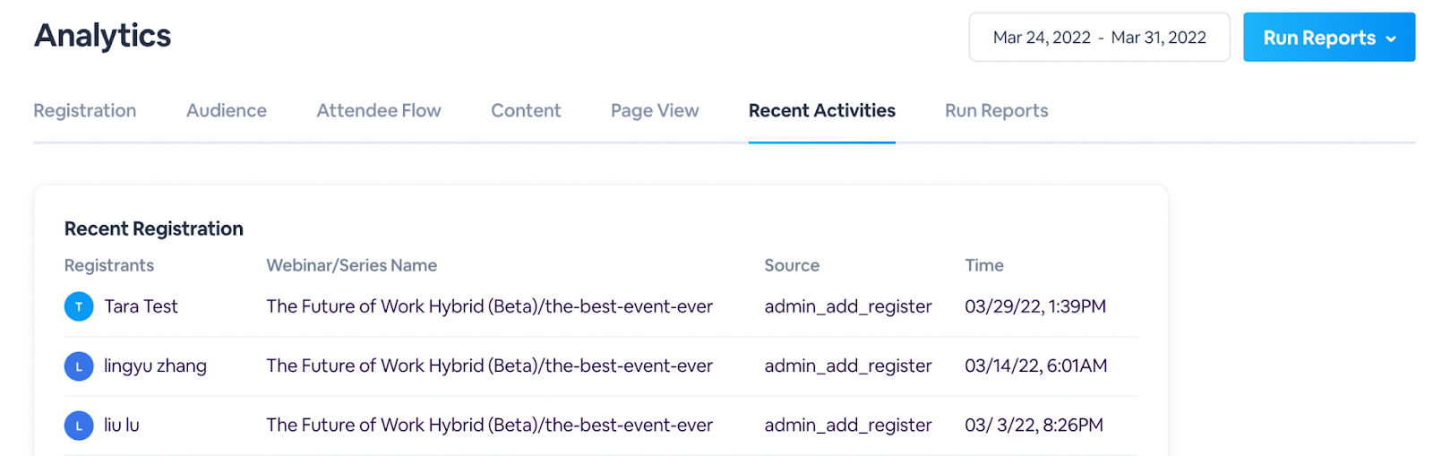
Under Recent Activities is a list of the most recent entries to individual sessions or booths. Under the Source column, you can see how each participant entered the session (whether they were redirected to the session or they registered for it on their own).
Run Reports
In Run Reports tab, you can send your event reports via email immediately or schedule them to send at another time. Each email links to a zip file containing all of your requested reports.
Want key stakeholders to receive analytics at consistent intervals throughout the event? You can add subscribers that will receive the overall event report consistently and at scheduled times.
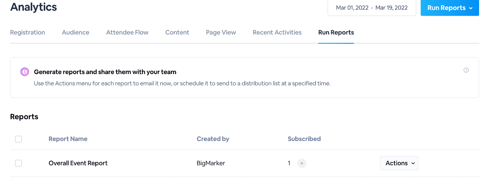
To add subscribers, click the plus button + and use the dropdown menu to select presenters/admins — or enter their individual email addresses in the provided text box. Click Save to continue. You can also delete recipients from the list by clicking the trash can icon.
From there, you can select to send the report immediately or schedule it to send at a later time. You can also start an email report to be sent by clicking Schedule under the Actions dropdown menu.
